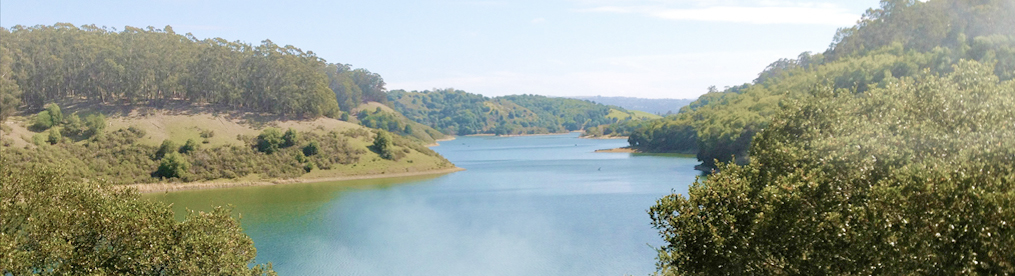
Twice now, during the past few months, I’ve been reminded of a “tip” offered by a professional photographer on how to make one’s photographs more appealing to viewers. That tip, as I’m sure you’ve guessed, was to include some object in your image that was, at least, partially red in color. The viewer’s eyes, the photographer claimed, are just naturally “drawn in” by the color red and, when you think about it, that professional photographer just may have had a point.
Let’s take, for example, those instances that reminded me of that article. The first came as I was on my morning walk. There, alongside the road, spread out over snow that was also heavily “coated” in sand and salt, were some bright red to orange colored berries. I wasn’t looking for those berries, which, by the way, turned out to be the fruits of American Bittersweet (Celastrus scandens). I just noticed the bright color out of the corner of my eye and, as I then turned to see just what had caught my attention, my eyes were just drawn in for a closer look.
The second instance, … well, … actually, this was the first, came as I was reading another blog entry by montucky titled “Fur and fungus.” As montucky wrote, he was hiking in the area when he noticed, “a splash of bright orange [that] caught my eye.” Like myself and the Bittersweet berries, that tiny spot of bright orange color caught his attention and he felt compelled to take a closer look. In montucky’s case, to my eye at least, that splash of orange color was a tiny sampling of fungus called Orange Fairy Cup or Orange Peel (Aleuria aurantia).
In the Eye of the Beholder!
It would seem obvious then that the color red (or orange) works well outdoors, in a natural environment, especially when it comes to attracting the attention of nature lovers or photographers and artists. But, the fact is, especially for photographers and artists, be they amateur or professional, their eyes are constantly searching for that next “composition.” So then, the question remains, does including some red or orange in an image really work in “drawing in” the casual viewer’s eyes to your photographs? Does it really make the viewer want to take a closer look at your image as opposed to someone else’s that does not have any red color in it? Of course, the professional photographer giving this tip assumed that your “intended viewer” would be an editor or art director. Since I’ve submitted a photograph to a magazine on just one occasion ([Wildlife Art Magazine, September/October 1998] and, no, there wasn’t anything with the color red in it), my experience hardly makes me an authority on the subject. Still, I’ve also done some exhibiting and, to a “small” degree at least, I have had “some” success from that photographer’s tip!
Here are two examples. I love close-up photography, however, one problem with close-ups, at least in outdoor natural settings, is that subjects are oftentimes hidden in the shadows. So, when photographing these red colored currant berries, I was also experimenting with the use of reflectors.
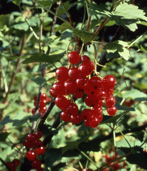
Being quite pleased with the results, I decided to have it framed and then entered it in the Topsfield Fair. (The Topsfield Fair was founded in 1818, thus giving its organizers “bragging rights” to the claim “oldest” fair in America.) While I did not win a ribbon from the fair judges, I did “win” a complement that, by far, touched me in a way that no ribbon could ever do. This complement, however, was one so faint, so subtle, that it was not until I got my entry back home and started to hang the image on a wall in my livingroom when I noticed a tiny handprint directly over some of the berries. Actually, it was not a full handprint but, rather, just the finger tips, as if this tiny person had attempted to pick the berries. I can, of course, only imagine what occurred but it does seem quite apparent that these red colored berries were so “eye catching,” so “appealing” in fact, that this small child not only needed to take a closer look but even had to attempt to “pick a few” (for a taste, no doubt). Now, I ask you, how flattering is that?
The next example, again, a close-up, was taken after a particularly severe ice storm.
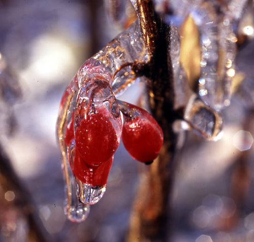
The sun appeared the next morning making everything look stunning! Or, so I thought at first. I took many photographs yet after a very short time, I noticed that everything started to look the same. It was, in a word, getting monotonous! But then, as I sat looking out my front bay window, having a cup of coffee to warm-up, once again, the red color of barberries caught my attention. Like everything else outdoors, each berry was coated in ice and, to my eye at least, it was the red color of those berries that just “made” this ice coated world seem much more interesting than simply the multitude of images I had already taken of one tree branch after another coated in transparent colored frozen water. Although I’ve not exhibited this image, I have used the slide on several occasions for calendars and postcards and, more often than not, I’ve received flattering comments from recipients.
So, what you you think? Did my experiences help bring attention to my photographs?
Think About It
The other evening, as my mother and I were watching television, (and she did know that I was writing this piece for my blog), she commented on the number of times that the color red was being used in the advertisements. Think about it, take note yourself the next time you sit down to watch the news or a sports event and I’d be willing to bet that just about every single advertisement has, at the very least, some type or even a part of their logo in red.
Think about it again, you see the color red used everywhere everyday wherever it is important to get your attention such as stop signs and stop lights, warning signs, fire engine trucks, flashing lights atop an ambulance. A red colored ribbon signifies the fight against heart disease (just as a pink ribbon is used for breast cancer). You see the color red for happier events too, like Santa’s suit, red colored poinsettias and, during holidays like yesterdays (Valentine’s Day), red roses are given along with chocolates that are almost always placed in a red colored heart shaped box! Finally, if you Google the color red, you’ll get page after page about “the power of red.”
Yes! It certainly seems to me that that professional photographer had a point when giving that tip to include the color red in your images. With little doubt, I’d say that the color red is definitely an “eye grabber!”